As you can see, two sides of the house are sided now. The green at the top I'm going to have to get used to. I pictured it coming down another row of shakes. And the rounded fishscales I'd hoped would be more pronounced. But it is growing on me. It looks a bit grange hall to me this way. I am going to get a gable decoration I think, to help soften the look. It would be painted white to match the other trim.
These are from Vintage Woodworks. Any opinions out there?
Here is the den "Beach House" blue, looking from the living room to the one and only closet downstairs, and the "Rose" half bath. This was all one room originally with a door to the kitchen on the right wall. We closed that off and opened the kitchen to the living room instead. I like this light-ish, but not a baby, blue.
Now, the blue bathroom upstairs is a bit brighter and deeper blue. It looks a bit too blue here. I'm going to try another picture and see if it looks better.
Yes, this is better. This is Delft Blue and it is deeper, though it looks different in different lights. I think this is going to look nice with the all white fixtures and the chrome and brushed nickel. It may still be a bit bright for my taste, but we'll see after the second coat and curtains, etc. Here it is again viewing the area where the washer/dryer unit will be placed. I'm still thinking that the eaves should be painted. Any opinions on that out there? It just seems that there is a lot of white if we leave the eaves white. Maybe it could be a lighter blue or some other color on the eaves?
I don't want it to feel too closed in, but I also don't want the ceiling to feel too low. When people wallpapered houses of this age, I think they went up the slants to the flat ceiling. Didn't they?
Same issue in the master bedroom. Love this Ocean color. But should it be taken up the eaves?
Here is the view from the kitchen to the living room now. The two paints look very similar, but the kitchen wall is lighter. It all depends on the natural lighting as to how it looks. I'm going to like looking out there and seeing the water.
And now. The view into the guest bedroom from the hall:
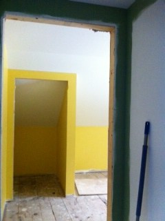
And the rest of the room. Again it seems that the yellow needs to be extended up the eaves. The hallway view especially doesn't look right to me with the closet door so outlined with yellow and then white. But it is a great yellow. Very cheerful and bright. It really did look like a light was on at the end of the hallway when we came upstairs. I think it deserves a fun, colorful stained glass fixture on the ceiling. What do you think? How about either of these by Oyster Bay?
These are both the same size and style though they look different from the different angles. I am leaning toward the blue with butterflies. I like the bit of yellow in the wings and can see using any of the other colors in the rest of the room for bedding or curtains. But I could be convinced of the dragonflies on a more subtle yellow mixture. We also have a square more Mission style fixture that is only 4.5 inches high and has yellows and browns in it. I could use that in this room instead of in the living room (where I'd planned on using it) and use one of these downstairs in the living room. Hmmm. And upstairs in my bedroom... how about this one:
Or maybe it's better in the living room? I'm going to sleep on it...


Lots of decisions here, Donna. Everything looks so wonderful to me. I like the many colors-would be my choice too. I had a yellow kitchen once & loved the brightness of it! I like the curlicue at the top for your gable, but that is just my idea, you know. I also prefer the light fixture with the reds, yet they are all beautiful. As for the eaves, I actually like the white staying-sorry. From the pictures, I think it would make the room look bigger. But again, when living in it, you get to choose what pleases YOU!
ReplyDeleteAll lovely to see!!!