Saturday, November 16, 2013

Summer, Fall 2013

My mug - my color palette
The above picture was taken from one of my favorite coffee mugs.  If the color is in here, it can be in this house... actually I had started picking out colors for the house and posting them on the refrigerator on different sides at different times of day, so I could see how I liked them individually and together.  Suddenly I saw my mug's colors and grabbed it.  Yup, they were all there.  Except for the flower color...so that made my exterior door color easy.  Vibrant Daylily will go on the door.

It has not been too productive here at Gull Haven this summer.  Our contractor has had some outside issues to resolve, unrelated to business, and we have let him off the hook for deadlines and progress for the time being.  Since we are in no hurry yet to get there, we are fine.

I've asked that he get the house closed up for the winter and install door hardware and outside lights.  He's going to get all that done, and then we'll see where we go from there for the winter.  Inside work should be easily done in the winter, hopefully.

We did meet a few times to discuss stains for floors and other woodwork.  That has been difficult, since I don't know what the two old floors will look like when they are rejuvenated.  We have a stack of old doors with great old doorknobs, so are looking forward to getting them installed.  For the blue den, we have decided to go with a 15 pane pocket door to save space in the den or livingroom, depending on how we would have made it swing.  That isn't an issue now!  Yea!  And in the small bathroom off the den, we are going to have a door made that is a small double door, so the swing has a reduced arc.


I think we've come up with the stain that should work.  The pictures here show some of the options and an old piece of woodwork to the far right.  It's pretty much impossible to get that old look in a hurry, it seems.  So it may have to age on its own while we wait.
 Old door, old floor, two new wood pieces trying to fit in
More auditioning wood stains
Our new old phone
I picked this up pretty cheaply on eBay a while back.  I can't decide if I want to repaint it, take the paint off and restore to black or leave as it is.  It's from the 1930's, so perfect for this house...and the color goes (see mug picture).

Friday, May 10, 2013

Spring 2013


It's been a long, snowy winter...but spring has finally officially arrived with the forsythia bush in bloom.  It doesn't look much different from the outside, but the back is now sided and readied for a mud room addition and a deck.


Now to pick the exterior door color.  Yellow and green in center = house colors.  Colors all around the yellow = door color options.

And the winner is Valspar's Vibrant Day Lily! (top right)  It's a little bit brighter on screen than in real life, but not much.  You know what color day lilies are, right?  That's that color.  Shocking.  It's so not me.  Or so not me a few years ago.  Now, I think it is me.  And not only that, but my husband helped me pick it out.  So it isn't just my fault when the neighbors complain.

Here is the flooring for the whole house, except the living room and den.  Those two floors are staying as they are.  The living room has gorgeous fir flooring.  The rest of the house will have flooring and window trim to match.  

Here is the window trim style as mocked up in the bedroom for our approval.  I have windowsills.  Yea!  Also in this picture, you can see how the side wall with the cubby and the small amount of eave, has been painted.  It was left white before, and I just didn't like it.
It's been painted in the yellow guest/den room and the blue upstairs bath, too.


They just look more finished this way.  I'm liking them better now.  The yellow in the guest room is growing on me.  It's a bit bright, but that's good for a small room.  It looks like there's always a light on in that room.  Speaking of which, it will be so exciting to see the lights in there.
And lastly, the wood trim stain for all areas.  We are getting old doorknobs and hinges that were on the old doors from the house, and some old same era doors that have been salvaged.

I believe the flooring is going in next week.  Trim for windows and doors is being worked on this week.  I guess we'll have to take a trip up again tomorrow and see what's been done since our last meeting two weeks ago.

If there's been progress, I'll update shortly!

Saturday, February 16, 2013

More Paint, More Siding

Well, are you ready.  I told you that the guest room would be something to see.  And it is.  We saw it today.  It is painted.  And though some people may not like it, I think I'm going to.  As we came up the stairs, at the end of the hall it looked like a light was on in that room, though there are no lights in the house yet.  I am not going to show you yet.  Pictures will be at the bottom.  I want you to be surprised and you wouldn't be if you could see them before I got to write about it.  The color is daffodil.  I could tone it down, but I think I'll leave it at least for a bit to make sure how I feel about it.
As you can see, two sides of the house are sided now.  The green at the top I'm going to have to get used to.  I pictured it coming down another row of shakes.  And the rounded fishscales I'd hoped would be more pronounced.  But it is growing on me.  It looks a bit grange hall to me this way.  I am going to get a gable decoration I think, to help soften the look.  It would be painted white to match the other trim.

These are from Vintage Woodworks.  Any opinions out there?


Here is the den "Beach House" blue, looking from the living room to the one and only closet downstairs, and the "Rose" half bath.  This was all one room originally with a door to the kitchen on the right wall.  We closed that off and opened the kitchen to the living room instead.  I like this light-ish, but not a baby, blue.

Now, the blue bathroom upstairs is a bit brighter and deeper blue.  It looks a bit too blue here.  I'm going to try another picture and see if it looks better.


Yes, this is better.  This is Delft Blue and it is deeper, though it looks different in different lights.  I think this is going to look nice with the all white fixtures and the chrome and brushed nickel.  It may still be a bit bright for my taste, but we'll see after the second coat and curtains, etc.  Here it is again viewing the area where the washer/dryer unit will be placed.  I'm still thinking that the eaves should be painted.  Any opinions on that out there?  It just seems that there is a lot of white if we leave the eaves white.  Maybe it could be a lighter blue or some other color on the eaves?
I don't want it to feel too closed in, but I also don't want the ceiling to feel too low.  When people wallpapered houses of this age, I think they went up the slants to the flat ceiling.  Didn't they?

Same issue in the master bedroom.  Love this Ocean color.  But should it be taken up the eaves?

Here is the view from the kitchen to the living room now.  The two paints look very similar, but the kitchen wall is lighter.  It all depends on the natural lighting as to how it looks.  I'm going to like looking out there and seeing the water.

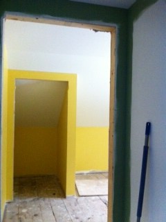
And now.  The view into the guest bedroom from the hall:


And the rest of the room.  Again it seems that the yellow needs to be extended up the eaves.  The hallway view especially doesn't look right to me with the closet door so outlined with yellow and then white.   But it is a great yellow.  Very cheerful and bright.  It really did look like a light was on at the end of the hallway when we came upstairs.  I think it deserves a fun, colorful stained glass fixture on the ceiling.  What do you think?  How about either of these by Oyster Bay?
These are both the same size and style though they look different from the different angles.  I am leaning toward the blue with butterflies.  I like the bit of yellow in the wings and can see using any of the other colors in the rest of the room for bedding or curtains.  But I could be convinced of the dragonflies on a more subtle yellow mixture.  We also have a square more Mission style fixture that is only 4.5 inches high and has yellows and browns in it.  I could use that in this room instead of in the living room (where I'd planned on using it) and use one of these downstairs in the living room.  Hmmm.  And upstairs in my bedroom... how about this one:

Or maybe it's better in the living room?  I'm going to sleep on it...

Wednesday, February 13, 2013

Two More Lights

Two more lights have arrived.  These are Tiffany sconces: one for the stairway and one for the hallway upstairs.  They don't match.  I don't want them to match.  It might look better if they did, but so far, I think I'm going with not matching.  The Jewelstone - brown, green and amber tones will be for upstairs in the hallway just outside of the guest room.  It can't extend very far out into the hall due to the pull down attic access stairs just above it.  The online measurements are not very accurate, in that I believe they said it extended 7 inches.  Well, that is without the shade on.  With the shade it extends 8".  This may still be okay.  If it isn't then it will go in the stairway....

This sconce also had incorrect measurements, extending 9 inches into the room, so it definitely cannot go in the hallway.  It will be mounted in the stairway, unless I think better of it and get a second Jewelstone sconce so they match.  The other thing that is a concern about this second sconce - the Meadowbrook - is that it plugs in!  That was not mentioned on the website, nor did it show a cord in the picture.  The nice thing is that it came with a cord cover.  But I don't want a plug in.  So my husband or the electrician will rewire it so it ca be hardwired.  IF I don't do that, then it just may be my light for reading in bed.  It's just SO pretty.  I still want it!

Saturday, February 9, 2013

First Coats of Paint

Finally after much ado involving getting more paint chips, posting them on my refrigerator with magnets, leaning them up on the countertops, laying them atop the kitchen stain glass lampshade, setting them beside each other in the order you would see them entering the house....oh, and probably a dozen more ado's...  I finally sent in my perfect picks to the contractor.  Enough is enough.  Paint it already!

And now those carefully chosen colors are going on the walls.  First coat is done on a few walls in a few rooms.  I love them so far.

The Bitter Rose stayed my choice in the small downstairs bath every time I changed my mind.  It was a constant.  I could picture it from day one and searched for the color I had in mind.  Here it looks a bit too bright pink, but in person it is very pretty.  Believe me.
Small half bath downstairs off the den.

Here is the kitchen by the back door.  Our table will be by the windows off to the right.  I am not sure of the kitchen cabinet colors yet.  I have a couple colors/stains in the running.

Here you can see a bit of the paint in the den and through the right hand door is the half-bath.
On the den's window wall is Beach House - a nice blue.
This is the living room on the front of the house.  The stairway beside the front door will be painted the same color.  This color is a little darker than the kitchen but blends nicely with it.  It just looks like the sun is shining more in the kitchen.
Seaweed Wrap adorns the living room, the stairway and the upstairs hall.
Aha, here's a better picture of the den's blue and you can see the living room through the doorway.  I am so excited about the colors.  Now I'm having much ado about lighting them.

Beach House and Seaweed Wrap
This is the master bedroom color.  I'm going to have the eaves painted also.  This color seems to change with the lighting, just as the real ocean does.  Sometimes it looks blue and sometimes green, and always a little grayish.  It's a very relaxing color to me, really as all the colors I've chosen are.  Just wait until you see the guest bedroom!
Ocean - seems fitting again.

Inside Primed and Ready


The upper photo shows the livingroom primed and ready for painting.  The protective covering is off the original flooring.  That will be sanded and refinished after a couple of holes where they put registers in are filled.
The second photo is the corner of the kitchen ready for painting.
Tomorrow or Monday, assuming we still have power, I will upload pictures of the painting that has been started.
The blizzard has delayed work for a few days now.  When this storm dies down we'll start up again.  The corner bullseyes will be coming from a place way, way up in way, way up northern Maine.  It's a little place called Harttwood in Wallagrass, Maine, which is just shy of the Canadian border on the northern border of Maine.

Here's what I picked out:
These will be in the upper corner trim of doorways and windows, stained the deep wood stain seen in older homes.

Tuesday, January 29, 2013

I Forgot

In the last post I edited and put in the rest of the color names.  I realized that I didn't really talk much about the wood and cabinets.

So here's what's what there.  We are using the old interior doors, except for the basement door, as it had too much moisture damage.  We are getting salvaged doors and having a couple closet doors made where we don't have anything that will work.  All wood will be oil stained to a deep reddish brown, as in many older homes here.  It will match what we started with.  The windows will have sills that I can put a candle or a plant on.  Of course that may mean that the cat wants to try it out...  But I like window sills - the kind we used to have, not that 1 inch slat that most houses have now. 

The upper corners of the window frame will have the old fashioned bullseye corners, is my thought so far.  But after looking at them in my parents' old house, it appears that the woodwork wasn't just flat board.  It has a grooved surface.  So now what?  Regardless, this is the color of my woodwork in the house.  Not sure if I will paint the kitchen woodwork to go with the cabinets or the bathroom woodwork white to match fixtures, but I don't think so.

I want a door like this one to go between the den and the living room.  Our contractor said he has a few vintage doors to choose from.  We'll have sheer curtains on the inside or some way of blocking the window in case we have any guests who need to sleep in there.
These are the old cabinets that we had to get rid of.  Some doors were broken and there was mold on some parts.  I would have kept them, but I can't risk any mold and I'd like to start fresh.  They weren't really "historic" cabinets anyway.  But I am trying to keep up the feel of them by using the same color, and somewhat the same style.  We'll see what the builder comes up with for us to see.
Oh, and don't you just know...I am messing with colors again.  I have a bit of a different idea on some of the colors and I'm getting myself jumbled up again.  I may fall back to the ones I had originally even, but I'm still playing with them and tweaking them some.  The final has to be soon though.  I think they are almost ready to paint.  When the weather's bad they won't work on the siding, so they need inside work to do.  I've been told they are ready for the bathroom sinks and the toilets now.

We are going to be able to get up there for a summer stay I think!  I can see the lobsters in the pot already.  We have an RV hookup beside the house, so visitors are welcome!  Well, we have to know you, of course!  Otherwise there will definitely be a fee involved!  This might be our retirement income...a single RV campground.

Today though, there is new snow on the ground.  So put away those summer dreams for now.  I have to shovel me a path...


Saturday, January 26, 2013

Colors and Wood and Cabinet Talk


Yellow is getting there.  They will stop at the top of the upper windows and change to green fish scales, and then a green vent in the peak. 
The vents just need priming and paint.  They are about 2 feet at the base, a foot tall and made of cedar. The paint will be the same English Cottage green as the shakes that will be going up above the yellow.


These are the paints for downstairs.  The red is called Bitter Rose, and is for the small downstairs bathroom.  Then the front blueish piece with the hole in it is the Formica (yes, I know, it's not granite) for the countertops.  It is really a green.  Then we have Buttered Popcorn for the kitchen walls (which is really minimal what with cabinets, windows and doorways) and the small green in the center is called Retro Green that I'm using on the cabinets.  It is actually an exact replica of the paint on the cabinets that were in here when we bought it.  That is exciting to me.  I wanted to have some of the look of the original somewhere and wasn't sure where that would come in. It looks a bit bluer in the picture than it really is.  It's actually a minty green.  Then the blue behind that is the color for the livingroom.  It's called Seascape .  The light, almost sage green is Sea Marsh.  This we'll use for the den, the stairway and the upstairs hall - which leads into the next picture:
From left to right:  Peach Preserves is for the guest room, Sea Sage is for the Master Bedroom with Niagara Blue (not shown) accents in the cubbies and closet, Sea Marsh (very light) is for the hallway (as mentioned before) and Seaweed Wrap is for the upstairs bathroom.

I am excited to have so many colors on the walls.  I hope I haven't overdone it, but I'm liking the idea of color.  In our current home I am very pleased with the pine walls, pine floors and pine ceilings everywhere and love the warmth and interesting knot holes everywhere.  So if I'm going to have sheetrock, it's going to have color!

My contractor brought up an interesting thought, though.  He said a home he'd just worked on had dark blue throughout, and that with the different lighting in each room it changed the tone of the blue just a bit and made it look different.  I guess if you picked a color you liked and made every room the same color but changed the accent pieces in each, it wouldn't be too bad.  Interesting thought.  I could do that with the Seaweed Wrap.  Then you just change accent pieces to other colors in the room - like green with peach, rose and green, green and beige, green and yellow.  Hmmm. Just when I thought I knew what I was doing.  I'm going to think this through one more time.


And I sign off for today with a picture of the well.  Water is constantly flowing out of it, and the ice crystals that form at the base are lovely.  The snow doesn't stay in that area due to the water flow.  It's been in the low teens lately, so it's very cold and everything is frozen pretty solid outside.  The sun's rays are lasting a bit longer now though.  It will be spring soon!  Well, not soon.  But it's coming.

Tuesday, January 22, 2013

Kitchen Sink

I ordered my kitchen sink yesterday.  It is on back-order from National Builder Supply, but placing my order meant a 2% discount on the sink that was already lower than other suppliers.  So since I don't have the kitchen cabinets ordered yet, I ordered the sink.  It will probably all come together about the same time. 

It isn't the one I had originally picked, but this one definitely fits in a 24" cabinet base with a bit of the drainboard over the left side dishwasher.  No sense in filling my kitchen with sink when I'll have two dishwashers.  This one also has a drain in the middle section in case of overflow and for getting water or rinsing without putting more water in the sink portion.  I had wanted white, but the two white ones I've seen are missing either a way to mount the faucet on the actual sink rim or are missing the middle drain.  So this is my compromise and I think it will actually work out better than the other options.

My other decision is to have wood grain ceramic tile on the kitchen floor.  You come directly into the kitchen from the outside, so this will be better for cleanup, and with radiant heat it works well, too.  I'm debating about the floors upstairs also.  I like wood, but it does have a tendency to expand and contract in the seasons.  Tiles don't do that.  I have seen at Lowe's and online, some tile planks that look an awfully lot like wood.  Actually, unless you felt the coolness, you wouldn't be able to tell the difference.  Since we have radiant heat, in the winter, the tiles will warm nicely and stay warm, and in summer they will be cool.  So, I'm thinking except for the wood we are salvaging in the living room, den and downstairs bath, maybe we'll just go with tile...